Going on with Kaggle's bike competition
Going on with the Kaggle competition about bike rentals, I tried out a decision tree classifier for finding out the importances of features. I gotta admit, I am not sure yet, what are the exact drawbacks of this method (i.e. what can be missed by this approach), but at least it shows you what you should also look at.
In scikit-learn this can be done by printing the feature_importances_ attribute of the trained decision tree classifier.
import pandas as pd
import numpy as np
from sklearn import tree

df = pd.read_csv('train_added.csv', index_col=0, parse_dates=[0])
y = df['count']

# delete the result columns
df = df.drop('count', 1)
df = df.drop('casual', 1)
df = df.drop('registered', 1)

clf = tree.DecisionTreeClassifier()
clf = clf.fit(df, y)

for col, imp in zip(df.columns, clf.feature_importances_):
    print('%s: %f' % (col, imp))
Which shows us for the Kaggle dataset:
season: 0.060665
holiday: 0.008030
workingday: 0.021309
weather: 0.061653
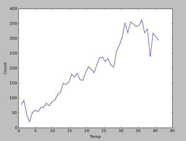
temp: 0.147404
atemp: 0.154334
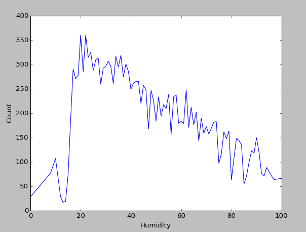
humidity: 0.222730
windspeed: 0.211515
hour: 0.112359
We already found out, that the hour of the day has an impact on bike rentals, but it seems we should also have a look at windpseed, humidity and temperature (where we should probably especially check for correlation between temp and atemp, so they don’t break our predictor later, in case we use a model that assumes independance between variables).
Feature analysis
So let’s have a closer look at the most important variables from the decision tree. At least from humidity and temp we can deduce a clear tendency in bike rentals when values rise or fall.
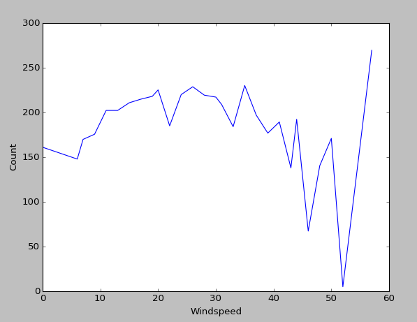
However, I am uncertain about windspeed. One could see a slight non-linear behaviour in the end, but the problem here is, that almost all values lie in the intervall [0,30]. Windspeed values higher than 40 are almost never observed.
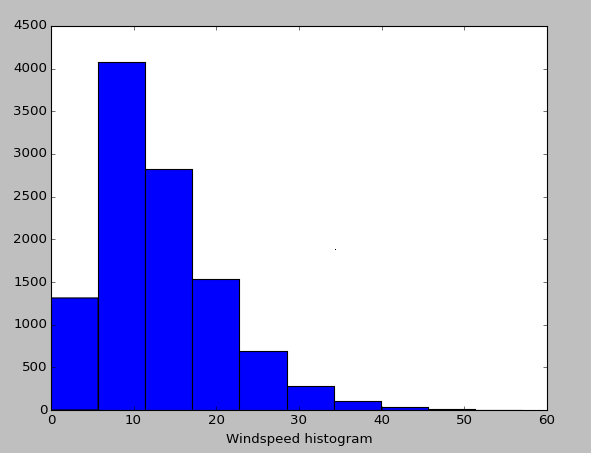
Thus, the whole righter part of the plot should be ignored. This lack of samples also explains the huge differences in bike rental count when windspeeds above 40 are detected: There are just not enough samples to give a reliable average value (a statistician would say the observation is not significant).
As said, one should also check the correlation between temp and atemp, which I already did. Thus I know that atemps behaviour will be about the same as temp, not giving us much information here.
One can use Numpy’s function corrcoff to calculate a correlation matrix for a given dataframe or also for a subset of columns. In this case the two desired columns are enough.
print(corrcoef(df['temp'], df['atemp']))This little piece of code gives us the correlation matrix for temp and atemp (in this order, but since we only have two values it wouldn’t matter anyway):
[[ 1.          0.98494811]
 [ 0.98494811  1.        ]]
So the correlation of each column with itself is of course 1. However, temp and atemp also have a correlation of 0.985, which is quite high. Thus, when training a classifier we have to keep in mind that the classifier might only work with independant columns (or at least it might work worse if there are strong dependancies).
With the information just collected, we now have an even better understanding of the data. I’m still wondering if maybe I can get more information out the windspeed column. Maybe it is more useful if separated into seasons? Maybe in winter people dislike harsh wind, but in summer they like it, because it feels cooler? Just an idea I will check later.
I do not maintain a comments section. If you have any questions or comments regarding my posts, please do not hesitate to send me an e-mail to blog@stefan-koch.name.