My first-impressions approach to the Kaggle "Bike Sharing Demand" contest
In this article I will share my approach to the Kaggle contest named “Bike Sharing Demand”. It is in my opinion a quite easy dataset, so it’s easy for me to learn with. It’s also a very good dataset for visualisations.
The first obvious dependancy that came into my mind was the one between temperature and bike count, because of course many people would want to use a bike when it’s warm, but not when it’s cold. I plotted both curves (all values normalized, so they have about the same amplitude), and got this result (red line is always bike usage count and blue line is temperature):
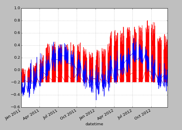
On this plot I recognized the next interesting aspects. One of them should have been obvious: Bike demand is lower in winter months and higher in summer months. But the other one was not so trivial, yet important for prediction. The bike demand had a constant rise between January 2011 and December 2012, just like the business cycle when it is plotted. So from this distant view, we have a sinus curve overlapped with a rising slope (in blue).
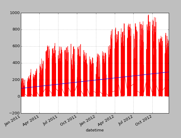
However, I was confused by the plot, because the lines always went up and down causing the whole plot to be colored. It then came to my mind that the data is not given in terms of days, but in units of hours. This means, that probably at night the bike count will drop pretty low. So I plotted one individual day giving me this (here the blue line is temperature again):
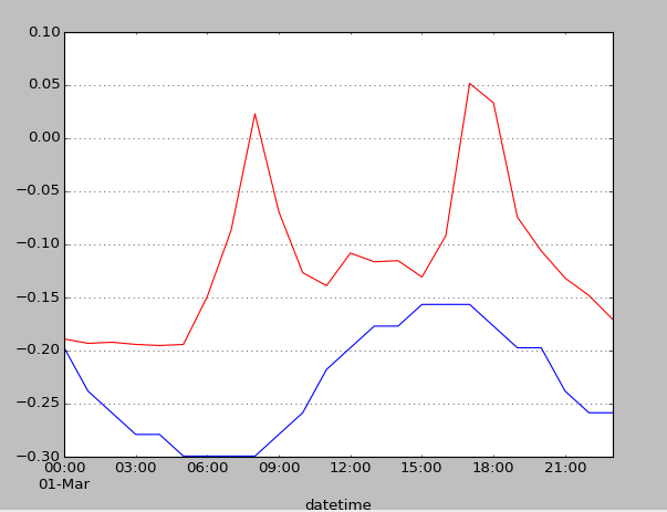
Here, one can see very well that bike demand is high at morning and evening, which seems like working hours. Oh! Then the bike demand could be different on weekends? I went to see in a calendar of 2011 if the 1st of March was a working day. And yes, it was. So I plotted some weekend day.
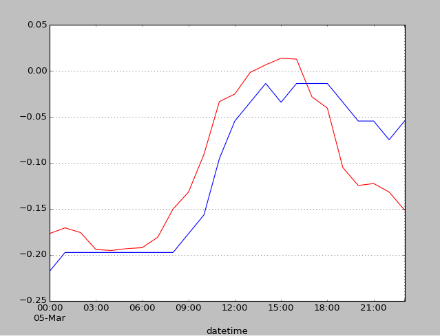
We can see a totally different situation now.
If we aggregate over all workingdays and non-workingdays we can see that this clearly is a scheme and not by accident. On workingdays we have two peaks at 7/8 o’clock and at 17/18 o’clock (when people commute to and from work), whereas on non-workingdays there is only one broad peak between 12 and 17 o’clock (when people usually do a holiday trip).
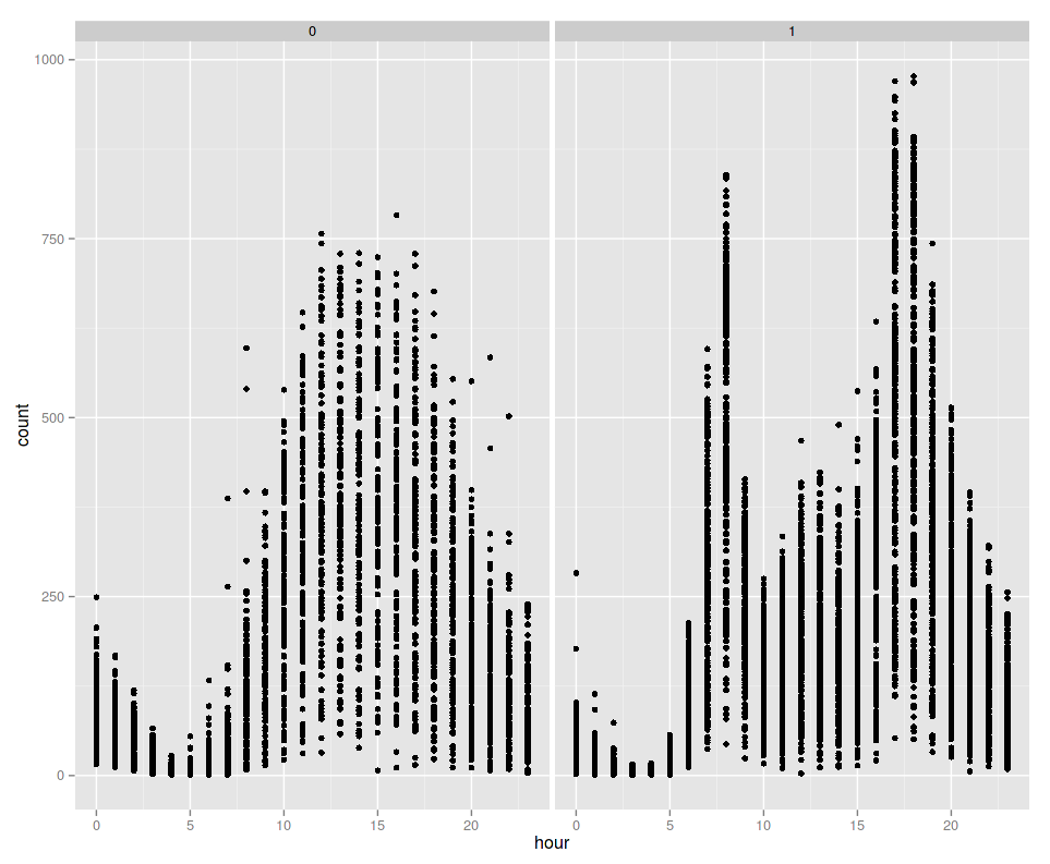
So what did I learn from this? First of all, that it’s always a good idea, if you have some class columns (R calls them factors) to check if there is some significant difference in the data for each class. And secondly, you cannot always rely on the features you already have, because in this case the time of the day together with the factor “workday?” is some important information. However, the time of the day is not given in the dataset by kaggle on its own. Instead, you will have to extract it from the datetime column yourself. In the format it is given, you cannot aggregate over the time alone.
I do not maintain a comments section. If you have any questions or comments regarding my posts, please do not hesitate to send me an e-mail to blog@stefan-koch.name.